
Travel Mobile App
The Problem
Planning a trip can be very stressful and has many moving parts that are hard to keep track of including a budget and bookings. Very limited tools are a one-stop shop for users when planning a trip.
The Solution
Offer users a platform that keeps them organized when planning a trip with features such as a budgeting tool, prompts to book elements of a trip, an itinerary, and a place to keep all travel documents needed.
My Roles
User Experience Researcher and User Experience Designer.
Tools Used
Figma, Google Suite, InVision, and Miro
01 User Research

Proto Persona
Creating a Proto Persona allows us to know the user group to target to start the research process.
Key takeaways:
-
The user is unorganized
-
The user enjoys travel and feels that life is too structured
Affinity Diagramming
After conducting interviews, the Affinity Diagram was created with many notes from the user interviews. The first image shows all of the notes taken, whereas the second image shows the common themes and categories discovered. This is a great tool to use to organize all of the data collected.


Persona
After conducting interviews, the persona was built based on research. This helped to visualize the users we were building the product for.
Empathy Map
Creating an Empathy Map helped the team to obtain a deeper understanding of the user and make sense of our qualitative research.

02 Ideation
Brainstorming
To kick off the prototyping phase, we started brainstorming using the I like, I wish, and What if method. We then took all of these notes and organized them into a feature prioritization matrix that can be found below!


Feature Prioritization Matrix
Creating the Feature Prioritization Matrix helped us to understand what features are most important to our users.
Key takeaways:
-
Easy budgeting tool
-
Simple process for bookings
-
Reward systems
Value Proposition
Using the Value Proposition tool, we were able to ensure that we were building a product that matches the user's needs.

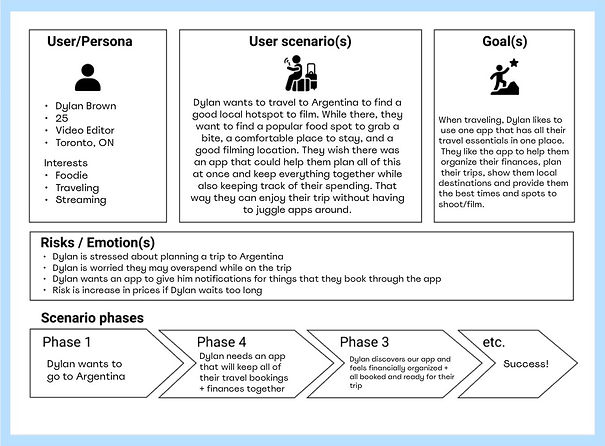
User Scenario
Using the User Scenario tool, we were able to outline a realistic situation where the user would typically use our product. This helped us to understand the behaviors of the user, which is very important during the design process to help refine features and spark new ideas.

Storyboard
Creating the storyboard allowed the team and I to shape the user journey and visualize our users in a scenario where they would use our product and the outcome of that.
User Journey Map
Using the User Journey Map tool, we were able to gain more insight into how the user could interact with our product, which allowed us to start to design a tool that our users would find easy and intuitive.

03 Prototyping
.png)
Style Guide
Creating a style guide allowed us to develop a cohesive design and stay on brand when making high-fidelity prototypes for both the desktop and mobile versions of the website.
The colours blue and green were chosen as they are earthy and are seen as calming.
User Flow
Creating a user flow illustrates the potential paths the user could take while using the application. This tool allowed us to jump into creating wireframes and start the prototyping phase.

IOS Mockups
After conducting many usability tests, there were a few bugs to be fixed such as including prompts to keep the user organized, adding plus symbols for the user to book multiple flights and accommodations


High-Fidelity Wireframes
Once the mid-fidelity wireframes were done we conducted usability testing, which resulted in very positive feedback. Afterwards, the design process took off! The design started off with a very white and bright application, but after testing, there was a change to the dark version, which got a much better response.